
Fortnite is one of the most competitive niches on YouTube. Thousands of creators upload the same meta, the same skins, the same map — and the thumbnail is what decides whose video gets watched. In a feed packed with lookalike gameplay, a sharp, high-contrast thumbnail is the single biggest lever on your click-through rate, and CTR is what tells the algorithm to keep pushing your video.
This guide covers exactly how to make a Fortnite thumbnail that earns the click — the correct size, the design rules top Fortnite channels use, a repeatable workflow, and how to get a professional result without Photoshop.
Why Fortnite thumbnails are their own game
Fortnite thumbnails have a look — bright, punchy, character-forward, often with a skin mid-action, a glowing item, or a shocked reaction face. Viewers scanning the feed recognize that energy instantly, and anything flatter or more realistic disappears next to it. The bar is high because the niche is crowded: your thumbnail isn't competing with your topic, it's competing with a hundred other Fortnite thumbnails on the same screen. Standing out means going bolder, not safer.
The correct Fortnite thumbnail size
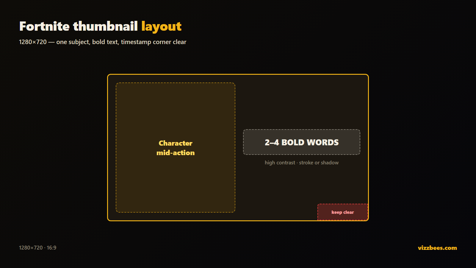
Fortnite content lives on YouTube, so it uses the YouTube thumbnail spec:
- Resolution: 1280×720 px (16:9 aspect ratio)
- Minimum width: 640 px
- File format: PNG for crisp text and edges; JPG acceptable
- File size: under 2 MB
Design at 1920×1080 and export down to 1280×720 so text and edges stay sharp. Full breakdown in the YouTube thumbnail size guide.
The 6 rules of a high-CTR Fortnite thumbnail
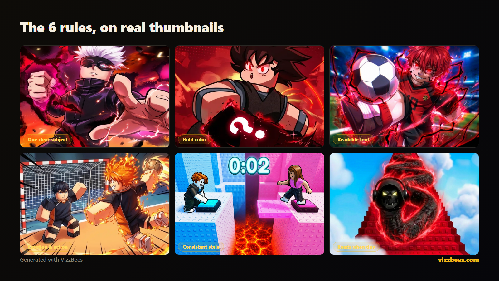
The top Fortnite channels repeat the same patterns. These are what win the click at feed scale.
1. One clear subject
A single skin, weapon, or reaction as the focal point. Two or three competing elements turn to mush at sidebar size. Pick the one thing the viewer should see instantly.
2. A character or skin mid-action
Fortnite thumbnails are character-forward. A skin in a dynamic pose — building, sniping, emoting, reacting — implies something is happening. Static, flat crops of gameplay lose to expressive, posed subjects every time.
3. Bright, saturated, high-contrast color
Fortnite's palette is already vivid — lean into it. Bold saturated colors with strong subject-to-background contrast pull the eye. Add a rim light or glow around the subject so it pops off the background.
4. Readable text — three words max
Two to four huge, bold words: "1 HP WIN," "NEW MYTHIC," "IMPOSSIBLE CLUTCH." Longer than that is unreadable at sidebar size. The text should add curiosity, not repeat your title.
5. Emotion and stakes
A shocked face, a last-second win, a glowing loot drop — signal high stakes. Fortnite viewers click on drama and rarity: something big just happened, or is about to.
6. Design for the smallest size first
Your thumbnail lives at sidebar and mobile size. Shrink it tiny — if the subject and text still read, you've won. If not, simplify. This is the rule most creators break.
Step-by-step: your thumbnail workflow
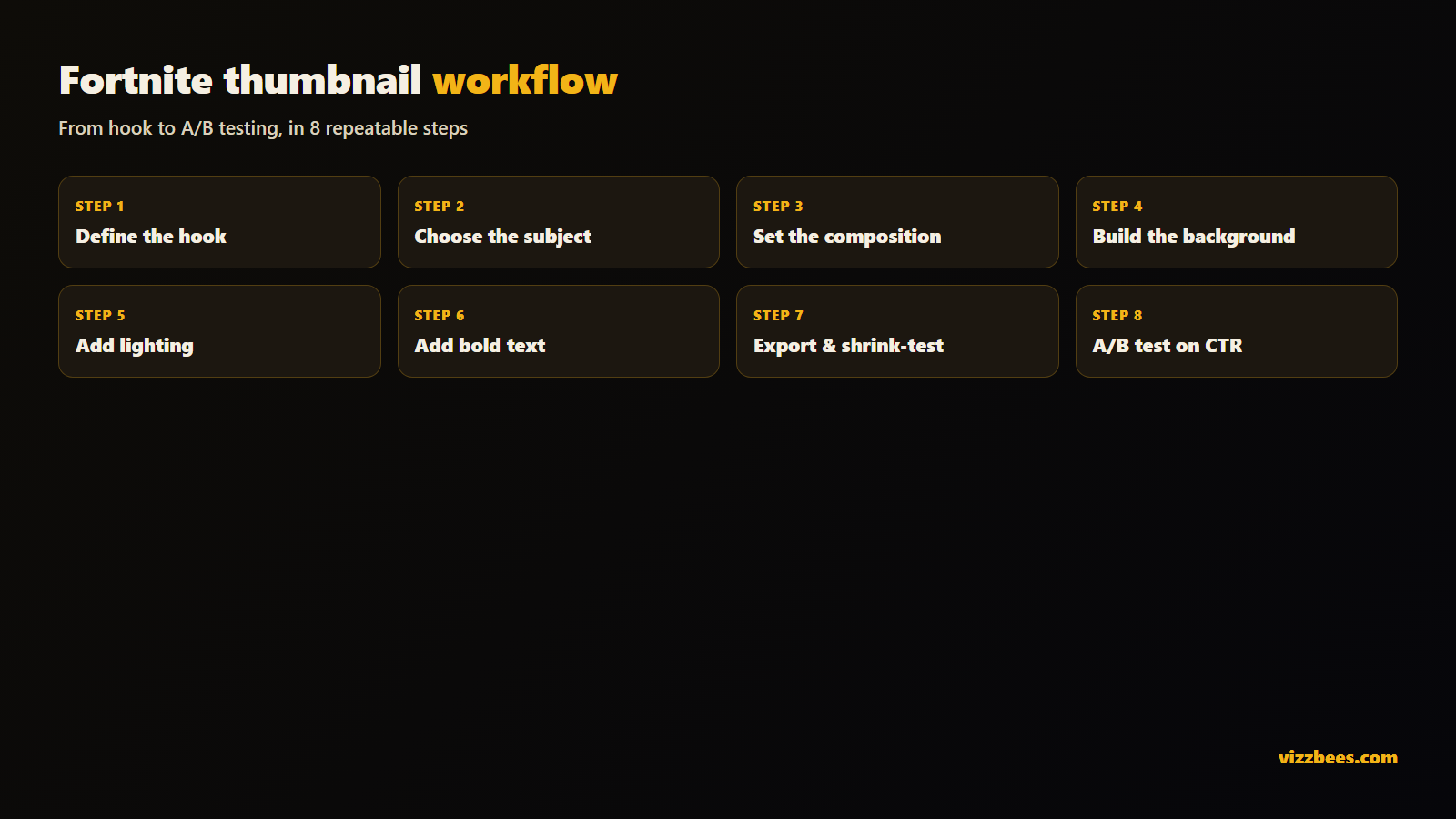
- Define the hook. In one sentence, what's the most clickable moment in this video? That's your brief.
- Choose the subject. A skin, weapon, or reaction that represents the hook. Give it an action pose or strong emotion.
- Set the composition. Subject filling 40–60% of the frame, slightly off-center. Keep the bottom-right corner clear for the timestamp.
- Build the background. Colorful, simple, blurred or low-detail so it never competes with the subject.
- Add lighting and separation. A rim light or glow lifts the subject off the background — the step that makes a thumbnail look pro.
- Add text (optional). Two to four bold words, high contrast, with a stroke or shadow so they read on any background.
- Export at spec and shrink-test. 1280×720, preview tiny before publishing.
- A/B test. Ship it, watch CTR in YouTube Studio, iterate. Swap thumbnails on underperformers and keep the winner.
Do you need Photoshop?
The classic route means cutting out a skin render in Photoshop, building a background, hand-adding glows and text, then exporting — an hour per thumbnail plus a learning curve. For a creator uploading daily in a fast-moving meta, that's a real bottleneck.
You do not need it. AI thumbnail generators tuned for Fortnite can produce a high-CTR thumbnail in seconds — character-forward subject, dramatic lighting, bold composition, correct 1280×720 size baked in. You describe the moment, pick a style, and get a finished, upload-ready asset. Generate a strong base with AI, then tweak text or crop in any free editor.
Try it free: Generate a Fortnite thumbnail with VizzBees — describe your clip, pick a style, and get a click-ready 1280×720 thumbnail in seconds. No Photoshop, no render times.
Common mistakes that kill your click-through rate
- Flat gameplay crops with no subject or composition — they vanish against posed thumbnails.
- Tiny detailed text that disappears at sidebar size.
- Repeating your title instead of adding a curiosity hook.
- Dark or muddy palettes that blend into the feed.
- Never iterating — your first thumbnail is a guess; CTR is the truth.
Fixing even two of these usually moves CTR within days.
Turn a good thumbnail into a growth engine
In a niche this crowded, the creators who iterate fastest win. Ship a strong first version using the rules above, watch CTR in YouTube Studio, and swap a fresh variant onto anything that underperforms. A designed, character-forward, high-contrast thumbnail reliably out-clicks raw gameplay — so consistent thumbnail craft compounds into feed dominance over time.
If you'd rather spend that time playing and editing than masking renders, an AI generator tuned for Fortnite gets you a click-ready 1280×720 thumbnail in seconds.
Ready to make yours? Create your Fortnite thumbnail with VizzBees →
FAQ
What size should a Fortnite thumbnail be? 1280×720 px, 16:9 aspect ratio — the YouTube standard. Use PNG or JPG, keep it under 2 MB, and design larger before scaling down for sharpness.
How do I make a Fortnite thumbnail without Photoshop? Use an AI thumbnail generator like VizzBees. Describe the moment and get a finished, correctly-sized 1280×720 thumbnail in seconds — no cutting out renders or hand-placing glows.
What makes a Fortnite thumbnail get more clicks? One clear subject, a skin or character mid-action, bright saturated high-contrast color, minimal bold text that adds curiosity, and a design that stays readable at tiny sidebar size.
Why do Fortnite thumbnails all look so bold and colorful? Because the niche is crowded and the feed rewards contrast. Bright, character-forward, high-drama thumbnails stop the scroll; flat or realistic ones get skipped.
Should the thumbnail text match my title? No — it should add curiosity the title doesn't. The title states the topic; the thumbnail creates the hook that makes someone click.
Can I use a screenshot as my Fortnite thumbnail? You can, but raw screenshots rarely out-click a designed, posed thumbnail. A composed image with a clear subject, lighting, and contrast almost always performs better.