
Your thumbnail decides whether a video gets watched. YouTube shows your title and thumbnail to a slice of your audience, and the click-through rate on that first impression tells the algorithm whether to keep pushing the video or bury it. Two videos with identical content can perform ten times apart on the strength of the thumbnail alone. It is the highest-leverage thirty minutes you'll spend on any upload.
This guide covers exactly how to make a YouTube thumbnail that earns the click — the correct size, the design rules top channels actually use, a repeatable workflow, and how to get a professional result even if you've never opened Photoshop.
Why the thumbnail is your most important asset
Impressions are cheap; clicks are everything. YouTube serves your thumbnail to cold viewers scrolling fast on a phone, surrounded by competing videos and sidebar recommendations. In that half-second, the thumbnail — not the title, not the topic — is what stops the scroll. A higher CTR means the algorithm shows the video to more people, which means more views, which compounds. A weak thumbnail quietly caps a great video's reach no matter how good the content is.
The correct YouTube thumbnail size for 2026
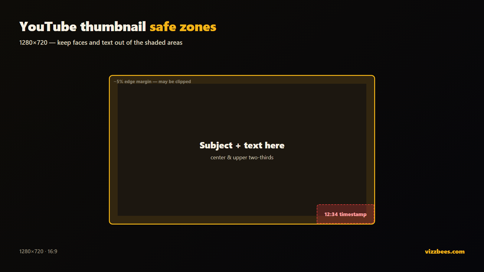
Getting dimensions right is the boring half, but wrong sizes get cropped or look soft. Here's the current spec:
- Resolution: 1280×720 px (16:9 aspect ratio). This is the YouTube standard.
- Minimum width: 640 px, but always design at full 1280×720 or larger.
- File format: PNG for crisp text and edges; JPG is acceptable.
- File size: under 2 MB.
Design bigger — say 1920×1080 — and export down to 1280×720 so text and edges stay razor-sharp. Full breakdown in the YouTube thumbnail size guide.
The 6 rules of a high-CTR YouTube thumbnail
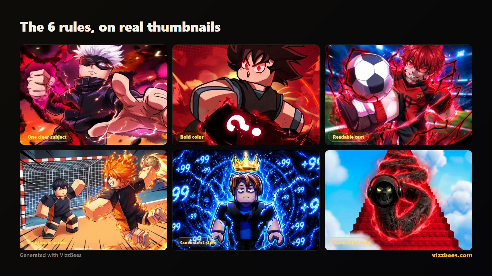
Look at any top channel and the same patterns repeat. These aren't opinions — they're what wins the click at feed scale.
1. One clear subject
The strongest thumbnails have a single focal point — a face, one dramatic object, one moment. Cramming three ideas in makes all of them illegible at sidebar size. Decide the one thing a viewer should notice instantly.
2. A big, expressive face
Human faces with strong emotion — shock, joy, fear, curiosity — convert better than almost anything else. The bigger and more expressive the face, the stronger the hook. If your content has a person, put their reaction front and center.
3. Bright, saturated, high-contrast color
The feed is a wall of thumbnails. Muted, realistic palettes disappear. Bold saturated colors with strong subject-to-background contrast pull the eye. Add a rim light or outline so your subject separates from the backdrop.
4. Readable text — three words max
If you use words, use two to four of them, huge and bold: "IT WORKED," "$1 vs $1000," "DO NOT DO THIS." Anything longer is unreadable at sidebar size. The text should add curiosity the title doesn't — not repeat it.
5. Curiosity gap, not the whole story
The best thumbnails make you need to click to resolve a question. Show the before, not the payoff. A visible reaction to something off-frame, a surprising pairing, an unfinished moment — give the eye a question the video answers.
6. Design for the smallest size first
This is the rule everyone breaks. Your thumbnail lives or dies at sidebar and mobile size, not on your monitor. Shrink it until it's tiny — if the subject and text still read, you've won. If not, simplify.
Step-by-step: your thumbnail workflow
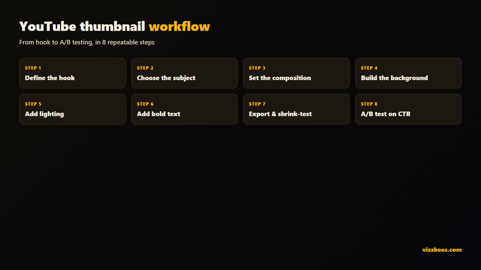
A repeatable process, whether by hand or with AI.
- Define the hook. In one sentence, what's the most clickable moment or promise in this video? That sentence is your thumbnail brief.
- Choose the subject. A face mid-reaction, a dramatic object, or a striking before/after. Give it emotion or tension.
- Set the composition. Subject filling 40–60% of the frame, slightly off-center. Keep the bottom-right corner clear — the video timestamp sits there.
- Build the background. Simple, colorful, blurred or low-detail so it never competes with the subject.
- Add lighting and separation. A rim light or outline lifts the subject off the background. This one step is what makes amateur thumbnails suddenly look pro.
- Add text (optional). Two to four bold words, high contrast, with a stroke or shadow so they read on any background.
- Export at spec and shrink-test. 1280×720, preview tiny before publishing.
- A/B test. Ship it, watch your CTR in YouTube Studio, then iterate. Test different thumbnails on the same video — CTR tells you the truth your gut can't.
Do you need Photoshop?
For years the "right" way meant masking a subject in Photoshop, building a background, hand-placing text and glows, and exporting — an hour per thumbnail plus a real learning curve. For a creator uploading weekly, that's a genuine bottleneck.
You do not need it anymore. AI thumbnail generators can produce a high-CTR thumbnail in seconds — expressive subject, dramatic lighting, bold composition, and the correct 1280×720 size baked in. You describe the video, pick a style, and get a finished, upload-ready asset. For most creators the smart move is to generate a strong base with AI, then tweak text or crop in any free editor.
Try it free: Generate a YouTube thumbnail with VizzBees — describe your video, pick a style, and get a click-ready 1280×720 thumbnail in seconds. No Photoshop, no learning curve.
Common mistakes that kill your click-through rate
- Tiny, detailed text that vanishes at sidebar size.
- Repeating the title in the thumbnail instead of adding curiosity.
- Realistic or dark palettes that blend into the feed.
- Raw screenshots with no composition — they almost never out-click a designed thumbnail.
- Never iterating. Your first thumbnail is a guess; the CTR data is the truth.
Fixing even two of these usually moves CTR within days.
Turn a good thumbnail into a growth engine
A thumbnail isn't set-and-forget. Ship a strong first version using the rules above, watch your CTR in YouTube Studio, and swap in a new variant whenever a video underperforms its potential. Because a designed, high-contrast, single-subject image reliably out-clicks raw frames, the creators who iterate fastest win the feed over time — regardless of budget.
If you'd rather spend that time making videos than learning masking pipelines, an AI generator built for thumbnails gets you a click-ready 1280×720 image in seconds.
Ready to make yours? Create your YouTube thumbnail with VizzBees →
FAQ
What size should a YouTube thumbnail be? 1280×720 px (16:9 aspect ratio), minimum 640 px wide. Use PNG or JPG, keep it under 2 MB, and design larger before scaling down for sharpness.
How do I make a YouTube thumbnail without Photoshop? Use an AI thumbnail generator like VizzBees. You describe your video and get a finished, correctly-sized 1280×720 thumbnail in seconds — no masking, layers, or rendering required.
What makes a YouTube thumbnail get more clicks? One clear subject, a big expressive face, bright saturated high-contrast color, minimal bold text that adds curiosity, and a design that stays readable at tiny sidebar size.
What is a good CTR for a YouTube thumbnail? Most channels land between 2% and 10% depending on niche and traffic source. Rather than chase a universal number, A/B test thumbnails on your own videos and keep the higher-CTR one.
Should my thumbnail text match my title? No — it should add to it. The title states the topic; the thumbnail text should create a curiosity gap the video resolves. Repeating the title wastes the space.
Can I use a screenshot as my thumbnail? You can, but raw screenshots rarely out-click a designed thumbnail. A composed image with a clear subject, lighting, and contrast almost always performs better.