
Every platform that shows a feed — YouTube, Roblox, Fortnite's Discover, Twitch — runs the same experiment thousands of times a day: put your image next to a dozen others and see which one gets the click. Click-through rate is the score, and it compounds: higher CTR means the algorithm shows you to more people, which means more clicks, which means more reach. The thumbnail is the highest-leverage image you'll ever make.
The rules that win that experiment are not taste — they repeat across every top channel and every top game, in every niche. Here are the seven, and the psychology behind why each one works.
1. One clear subject
The rule: a single focal point — one character, one object, one moment. Not three.
Why it works: a viewer gives your thumbnail about half a second of peripheral attention. One strong subject registers in that window; three competing elements register as noise and get scrolled past. Every element you add divides attention the others get.
The test: shrink your thumbnail to the size it'll appear in a phone feed. If you can't say instantly what it's about, neither can a viewer.
2. Faces and emotion
The rule: an expressive face — shock, joy, fear, determination — beats almost any object or scene.
Why it works: human brains process faces before anything else in the visual field, and an exaggerated emotion is a one-frame story: something happened to this person. That's an open question the viewer needs the video to close. Even in games without human faces, an expressive character pose carries the same signal.
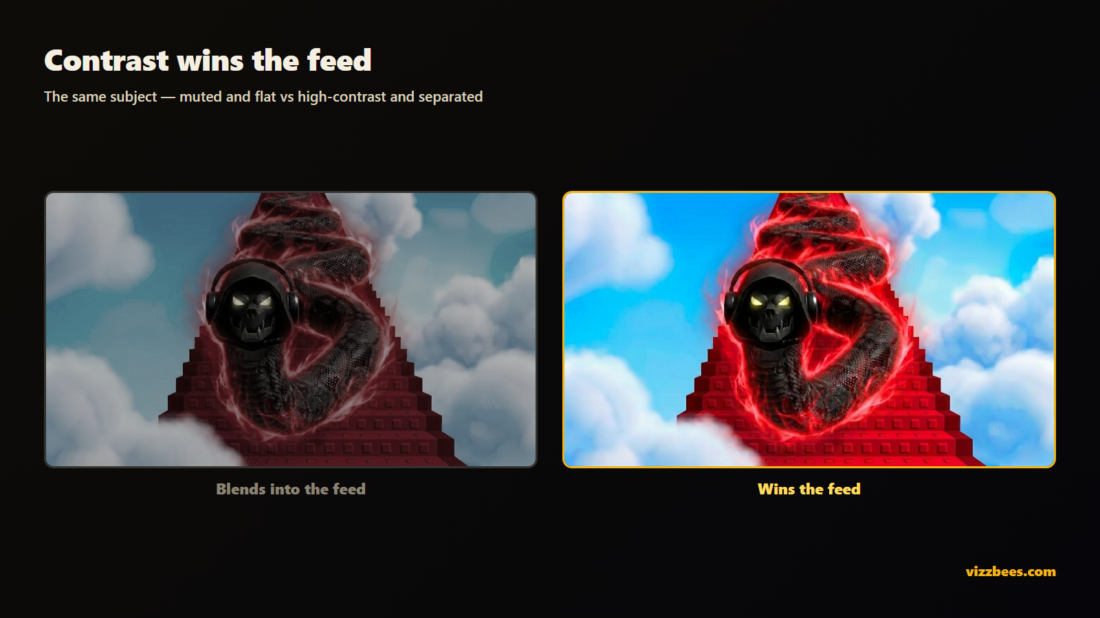
3. High contrast, saturated color
The rule: bold, saturated colors with strong separation between subject and background. Rim lights and outlines are the pro move.
Why it works: feeds are walls of dim, similar frames — mostly gameplay footage at natural exposure. The eye is pulled to whatever breaks the pattern. Muted, realistic palettes are the pattern; a high-saturation subject popping off a contrasting background breaks it.
4. A curiosity gap
The rule: show the before or the reaction — never the payoff. Give the eye a question only the click answers.
Why it works: a resolved image is a finished story; there's no reason to click it. A character reacting to something off-frame, a "day 1 vs day 100" split, a red arrow pointing at something small — these open a loop the brain wants closed. The title states the topic; the thumbnail creates the itch.
5. Readable text — or none
The rule: two to four huge, bold words with an outline or shadow. Or no text at all. Nothing in between.
Why it works: at feed size your thumbnail renders around 150–300 pixels wide. Sentence-length text turns to fuzz — it costs space and adds nothing. Three words the viewer can read in the half-second window ("100 DAYS," "IT WORKED," "1 HP") add stakes. And the text must add to the title, not repeat it: repeated text wastes the single most valuable pixel real estate you have.
6. Design for the smallest size first
The rule: judge every thumbnail at the tiniest size it will be displayed — a phone feed, a sidebar — not full-screen in your editor.
Why it works: this is the rule everyone breaks, and it silently invalidates the other six. Detail that looks great at 1920×1080 vanishes at 168 pixels. Most impressions happen at small sizes, so the small version is the thumbnail; the big one is just the source file. Shrink-test before you publish, every time.
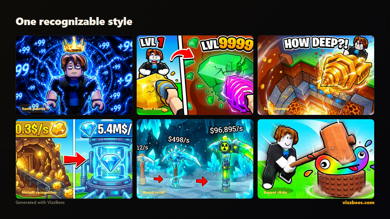
7. Consistency across your brand
The rule: one recognizable style across your icon, thumbnails, and every platform you post to.
Why it works: CTR isn't only won on first contact. Returning viewers scan the feed for you — a consistent palette and style is what lets them find you instantly. Channels with a recognizable look convert their existing audience at far higher rates, and that baseline CTR lifts everything the algorithm does for them.
The same rules, every platform
These seven rules don't change between platforms — only the sizes and the native art style do:
- YouTube: 1280×720, faces and curiosity gaps dominate — see the YouTube guide and size guide.
- Roblox: 512×512 icons and 1920×1080 gallery art in the blocky style players recognize — see the Roblox guide and size guide.
- Fortnite and Minecraft: character-forward, high-drama, posed — see the Fortnite guide and Minecraft guide.
The eighth rule: iterate on data
Your first thumbnail is a hypothesis. CTR is the experiment result. The creators who win feeds aren't the ones who guess right the first time — they're the ones who ship, read the number, and swap in a better variant while everyone else moves on. Treat every thumbnail as version one.
That's also the honest case for generating rather than hand-building: at ~6 seconds per render you can test five hypotheses in the time a manual edit produces one.
Put the rules to work: Generate a thumbnail with VizzBees — the seven rules above are baked into every render, tuned per platform (Roblox, Fortnite, YouTube, Minecraft), at the correct sizes. Free to start.
FAQ
What makes a thumbnail get more clicks? One clear subject, an expressive face or pose, high-contrast saturated color, a curiosity gap the video resolves, three-words-max bold text, readability at tiny sizes, and a consistent brand style. The rules repeat across every top channel and every platform.
What is a good CTR for a thumbnail? It varies by platform and traffic source — on YouTube most channels land between 2% and 10%; on Roblox around 2–2.4% QPTR is typical and top games reach ~3.6%. Rather than chase a universal number, A/B test against your own baseline and keep the winner.
Should thumbnails have text? Either two to four huge bold words that add stakes the title doesn't — or no text at all. Sentence-length text is unreadable at feed size and wastes the space.
Why do faces work so well in thumbnails? Brains process faces before anything else, and an exaggerated emotion implies a story that needs resolving. An expressive character pose carries the same effect in games without human faces.
Do the same rules work for Roblox, YouTube, and Fortnite? Yes — the seven fundamentals are identical. What changes per platform is the display size and the native art style viewers expect. Purpose-built tools handle both automatically.
What's the biggest thumbnail mistake? Judging it full-screen. Most impressions happen at 150–300 pixels wide, so detail-heavy designs that look great in an editor turn to mush where it counts. Shrink-test before publishing.